Description: PNG image
|
| From: | David De La Harpe Golden |
| Subject: | bug#6693: 24.0.50; font-lock-(builtin|doc) faces are *way* too close |
| Date: | Mon, 04 Jul 2011 01:52:06 +0100 |
| User-agent: | Mozilla/5.0 (X11; U; Linux x86_64; en-US; rv:1.9.2.18) Gecko/20110626 Icedove/3.1.11 |
On 03/07/11 15:34, Drew Adams wrote:
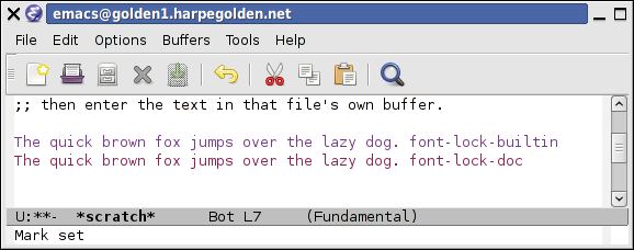
Just _look_ at the colors, using emacs -Q.  Do the same in an older release
also, to compare.  You should be able to see the problem clearly.
Computer systems vary quite a bit in their color reproduction, and different people can have different color vision, and not just in a "complete red/green colorblindness" fashion either [1].
I'd say we absolutely should try to keep the emacs out-of-box color scheme colorblind-safe, so some people having problems _is_ a reason to change the scheme. It's just an assumption that everyone is seeing what you see may be faulty. font-lock-doc (#8b2252 or so) definitely still looks pretty different to font-lock-builtin (#7a378b or so) on my system. Are the colors actually used on your system even coming out as similar hex values to those?
See also samples in old emacs-devel thread [2]

[1] http://en.wikipedia.org/wiki/Color_blindness#Anomalous_trichromacy

[2]
http://lists.gnu.org/archive/html/emacs-devel/2009-07/msg01582.html
http://lists.gnu.org/archive/html/emacs-devel/2009-07/msg01588.html
![]() emacs_builtin_vs_doc.png
emacs_builtin_vs_doc.png
Description: PNG image
| [Prev in Thread] | Current Thread | [Next in Thread] |