Description: PNG image
|
| From: | Arthur Maciel |
| Subject: | Re: [Chicken-users] Wiki design |
| Date: | Sat, 4 Jan 2014 15:38:39 -0200 |
ArthurDear Thomas, thank you for your feedback!I gave up setting the #content border before because there wasn't a solution that worked on all browsers - each one misaligned the border contact between #menu and #container in its own way :)
But I agree that no border is as bad as a misaligned border, so I put it back.About the Open Sans... I changed to Noto Sans and I don't expect it to work fine on your browser/OS/system, but using default fonts really look "old style" to me. Maybe other opinions could help us to decide.
I would appreciate another look on it if possible.
https://dl.dropboxusercontent.com/u/621606/chicken-wiki.tar.gz
A Happy New Year to all!2013/12/30 Thomas Hintz <address@hidden>
Arthur,
Thanks Arthur! It looks great overall!
On Tue, Dec 17, 2013 at 11:42 PM, Arthur Maciel <address@hidden> wrote:
> Dear chickeneers,
>
> I messed up a bit with the wiki design and below is a link to a sketch.
>
> https://dl.dropboxusercontent.com/u/621606/chicken-wiki.tar.gz
Design by committee is not always a good idea so feel free to disagree
but I have a few thoughts.
I think the top of the #content div really should have a border like
the rest of the box. It just doesn't lock your eyes in as well with it
missing. Of course that won't be that easy to do but you could move
the #menu div down a pixel with a higher z-index so it overlaps the
#content box that has a top-border so it still looks right.
I think the show/edit/history links could use a little more space
between them. They are tricky to easily hit even on a mouse
(non-touch) device.
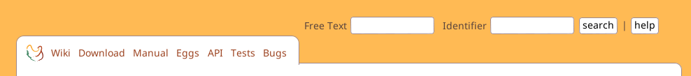
Not a huge deal but the open-sans font is fuzzy for me. I've attached
an image of it. Unfortunately fonts are done so differently across
browsers, OSes, and even individual monitors and settings that they
are hard to get looking good on all systems. I think that the common
fonts are often set to work well with most conditions so it may be
better to just use one of them. Or maybe some of the new CSS3
attributes would help? Again, not a big deal.
Any ways, looks really nice overall. And feel free to ignore my
suggestions if you disagree.
All the best,
Thomas Hintz
![]() wiki-search.png
wiki-search.png
Description: PNG image
![]() wiki-search-2-chromium.png
wiki-search-2-chromium.png
Description: PNG image
![]() wiki-search-2-firefox.png
wiki-search-2-firefox.png
Description: PNG image
| [Prev in Thread] | Current Thread | [Next in Thread] |