Description: PNG image
|
| From: | Mathias Dahl |
| Subject: | Re: font-lock-warning-face hard to read because it is bold |
| Date: | Tue, 16 Jan 2007 18:39:05 +0100 |
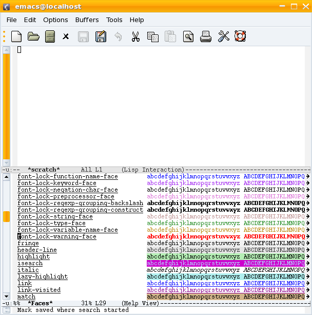
`font-lock-warning-face' is bold. That makes it very hard to read, at
least on w32 with default fonts.
It looks quite OK under GNU/Linux, at least in my opinion. See the
attached screenshot. How does it look under w32?
![]() fontlockwarning.png
fontlockwarning.png
Description: PNG image
| [Prev in Thread] | Current Thread | [Next in Thread] |