[Top][All Lists]
[Date Prev][Date Next][Thread Prev][Thread Next][Date Index][Thread Index]
list of links at top of `C-h m' display is hard to read
|
From: |
Drew Adams |
|
Subject: |
list of links at top of `C-h m' display is hard to read |
|
Date: |
Sun, 11 Mar 2007 16:04:54 -0700 |
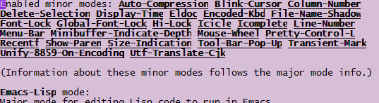
At the top of the `C-h m' display is a list of enabled minor modes. Each
list member is a link to a section below. The text of these links is bold
and underlined.

The list would be more readable if the links were not bold. Bold is
problematic for many fonts in Emacs, for some reason, and even with a good
font (e.g. the default) it adds nothing here but clutter.

The list would also be clearer if it were in tabular form, with items
separated by at least two spaces. This is because 1) minor-mode names often
have hyphens, and 2) the links are underlined. With only a single space
separating items, the mix of single-space, hyphens within mode names, and
underlining makes it difficult to distinguish the items. A tabular layout
would help.

Also, after you click a link and go to its section, it would be good if that
section had a `Top' link to take you back to the buffer beginning (same as
`M-<'). If you're clicking the mouse, you don't want to reach for the
keyboard.

Attached is a screenshot showing how bad bold looks with some fonts. The
font in question (Lucida Console) is fine without bold, as you can see. Bold
is OK to make isolated terms stand out, but it is not good for links,
especially if they are multiple-word (or hyphenated words), and especially
if multiple links are strung together, as is the case here.
 throw-mode-links.png
Description: PNG image
- list of links at top of `C-h m' display is hard to read,
Drew Adams <=