[Top][All Lists]
[Date Prev][Date Next][Thread Prev][Thread Next][Date Index][Thread Index]
Re: Terrible underline
|
From: |
David De La Harpe Golden |
|
Subject: |
Re: Terrible underline |
|
Date: |
Thu, 06 Mar 2008 23:31:25 +0000 |
|
User-agent: |
Mozilla-Thunderbird 2.0.0.9 (X11/20080110) |
David Kastrup wrote:
> "Lennart Borgman (gmail)" <address@hidden> writes:
>
>> I get terrible underlines with CVS Emacs 23, see the attached
>> picture. I guess this has something to do with the new font handling,
>> or?
>
> They look fine to me. Have you looked at the screenshot? Maybe it
> captures the way things should look rather than how they actually do?
>
Lennart's screenshot doesn't look good to me - it's underline merges
with the character bases (and doesn't break for the p descender like it
should if the underline is crossing it, but that's a more subtle issue).
However, it's probably font-dependent and font-size dependent. I
imagine emacs could be using some metrics from the font to decide where
to position the underline... And there's also a quantisation issue - at
small font pixel sizes, the "natural" position for an underline could
have to be distorted to match the pixel grid for a sharp, detached
underline.
Lennart, you might just try a different font and/or bigger font size,
see if the underline detaches from the bases...
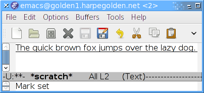
Attached is what underline looks like on an out-of-box cvs build on my
system (which is apparently defaulting to bitstream vera sans. In fact,
I can't seem to stop it using bitstream vera sans at the moment, but
that's another issue, see bug #35).
As you can see, it's not quite perfect (due to aforementioned descender
issues), but much nicer than Lennart's screenshot.