[Top][All Lists]
[Date Prev][Date Next][Thread Prev][Thread Next][Date Index][Thread Index]
Customize UI makeover?
|
From: |
Drew Adams |
|
Subject: |
Customize UI makeover? |
|
Date: |
Sun, 27 Apr 2008 15:43:47 -0700 |
Customize is an atrocious UI, at least in terms of its appearance.
Wouldn't some young turk who doesn't mind tackling the widgetry code labyrinth
please try to make a few cosmetic improvements? That could be a good summer
project. (No, not I; I took a look and it made me ill. Not to mention that I'm
no longer a young turk.)
The place to start would probably be the widget code, wid-edit.el, not the
Customize code, cus-edit.el, because the ugliness is more than skin-deep.
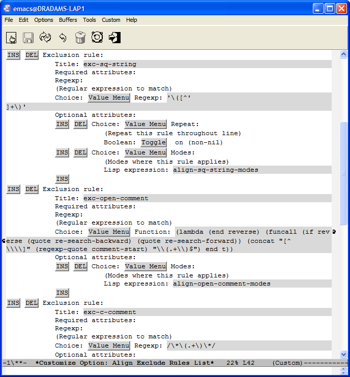
Attached is a screenshot of a portion of the buffer of `M-x customize-option
align-exclude-rules-list', with emacs -Q (after `load-library align'). It gives
an idea of the jungle we are presenting users with. It even has one line that is
152 characters wide - and that line would be even longer, but it includes a Lisp
string with an embedded newline char.
Some feedback (possible things to work on):
1. We have a general button problem: the raised buttons are, well, butt-ugly.
Yes, we need some visual indication of a button, but the current appearance is
pretty primitive. Most UIs don't use raised buttons unless they represent
toggles, where raised means one state (e.g. off) and recessed means the other
state (e.g. on), and the button text makes the state clear. Most UIs use images
for buttons. When images are not available we could use a more primitive
approach.
2. Button labels `INS' and `DEL' could be just `+' and `-'. Or perhaps `+' and a
typical deletion symbol `X'.
3. Button label `Value Menu' could be just `Choose'.
4. Or (but it might require a little more coding), button `Value Menu' could use
as its label the current choice's tag and include a tiny triangle to indicate
additional choices.
5. Tag values that are implicit and simply repeat the type of the field could be
eliminated (not shown): `Choice:', `Regexp:', `Lisp expression:', `String:',
`Cons-cell:', and so on. A tooltip should suffice to indicate what a field is.
When it doesn't, the particular field should probably be given its own specific
:tag. Display of the implicit (generic) tags just adds more noise to the jungle.
E.g. a user typically doesn't need to know that a field is a cons cell; it's
enough to show the two parts of the cell. We at least do this the right way for
type `alist' - we show just the key and value components directly, no
`Cons-cell:' label for each cons. Look at the difference between the types
(repeat (cons foo bar)) and (alist :key-type foo :value-type bar).
6. Child fields are indented too much. There is no reason to indent the content
of a `repeat' field (what's under the `INS DEL') by 12 spaces. When you have
nested `repeat's, as in `align-exclude-rules-list', this really gets out of
hand.
7. A tag should be on its own line. Tags can be long - they are descriptions.
The second of the following is better (where `Choose' is the button label, per
#3, and the default tag value `Choice:' is eliminated, per #4):
Choice: Value Menu Seventy (70) character tag that describes some particular
choice well.
Choose
Seventy (70) character tag that describes some particular choice well.
Plus, for some types of choice values (e.g. `string'), there is an editable
field in addition to the tag. In that case, the editable field should also be on
its own line:
Choose
Hyper-Foo Toto-Mode Title:
The Current Title, Which in This Case Is a Long String
8. More generally, a value, including a value in a `Value Menu', should
typically be on its own line. Yes, some values are short, but some (strings,
Lisp expressions, file names) can be long. Perhaps the display width of a given
value can be used to decide whether to print it on a new line.
9. Lisp expressions (e.g. functions) should be pretty-printed. That makes them
more readable and conserves horizontal space.
10. In general, we should decrease the horizontal space used, with the tradeoff
of increasing the vertical space used. That makes things more readable and can
lead to savings of screen real estate (for both windows and frames).
Yes, I realize that some users use Emacs full screen and split windows
vertically. But some users split windows horizontally or use
one-buffer-per-frame - and lines that are long (152 chars!) mean wasted
horizontal space. Like *Help*, we should aim to have *Customize* buffers be less
than 80 chars, when possible.
While it is true (IMO) that the widget and customize code is difficult to
penetrate, it is also true that once it is fathomed we have infrastructure to do
some of these things ready-to-hand. We have code to pretty-print a Lisp sexp,
for instance.
This UI has been lingering (festering) in about the same state visually for a
long time now. Many people have recognized that it is not too user-friendly. But
the basic interaction and, especially, the behind the scenes functionality
(types etc.) is fairly solid. I think that even a minor a face lift could go a
long way toward making it palatable.
 throw-align-widget.png
Description: PNG image
- Customize UI makeover?,
Drew Adams <=