[Date Prev][Date Next][Thread Prev][Thread Next][Date Index][Thread Index]
Re: HTML-Info design
|
From: |
Paul Eggert |
|
Subject: |
Re: HTML-Info design |
|
Date: |
Sun, 28 Dec 2014 15:45:45 -0800 |
|
User-agent: |
Mozilla/5.0 (X11; Linux x86_64; rv:31.0) Gecko/20100101 Thunderbird/31.3.0 |
On 12/28/2014 03:08 PM, Lars Ingebrigtsen wrote:
This is what an Info buffer looks like on Fedora 19:
I see more than that on Fedora 21 with "emacs -Q". Please see the first
attachment. There are two ways to go back (a "Previous" icon, and a
"Prev: Buffer List" text, and two ways to go forward (a "Next" icon, and
a "Next: Killing Buffers" text that is confusingly in the opposite order
of the buttons), and two ways to go up (an unlabeled up icon, and an
"Up: Buffers" text). Plus, the text does not rearrange itself to fit
the window size, and since my window is not the default size the text is
pretty hard to read. It's a confusing UI, for someone not already used
to it.
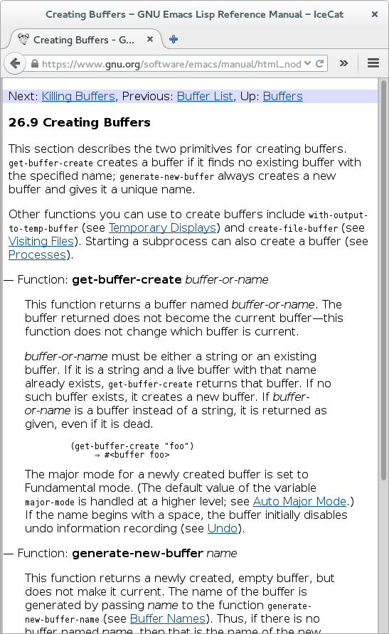
In contrast, the same documentation on Icecat (see 2nd attachment) is
easier to read and for a newbie to navigate through. There's only one
set of buttons, the text fits the window, the font (though still pretty
large) is not the enormous size that Emacs uses, and the text is nicely
reformatted to fit the window. (One other nicety: some unnecessary and
distracting quotes are omitted.) Overall there's about 50% more useful
information in the same screen space, and it's more readable despite the
smaller font size. This is a significantly better experience.
 Emacs.png
Description: PNG image
Icecat.png
Description: PNG image
- Re: HTML-Info design, (continued)
- Re: HTML-Info design, Stefan Monnier, 2014/12/29
- Re: HTML-Info design, Stefan Monnier, 2014/12/29
- Re: HTML-Info design, Stefan Monnier, 2014/12/29
- Re: HTML-Info design, Ivan Shmakov, 2014/12/28
- Re: HTML-Info design, Stefan Monnier, 2014/12/28
- Re: HTML-Info design, David Kastrup, 2014/12/28
- Saving default font? (was: HTML-Info design), David Kastrup, 2014/12/28
- Re: Saving default font?, Lars Ingebrigtsen, 2014/12/28
- Re: HTML-Info design, Lars Ingebrigtsen, 2014/12/28
- Re: HTML-Info design, Lars Ingebrigtsen, 2014/12/28
- Re: HTML-Info design,
Paul Eggert <=
- Re: HTML-Info design, Nic Ferrier, 2014/12/28
- Re: HTML-Info design, Lars Ingebrigtsen, 2014/12/29
- Re: HTML-Info design, Eli Zaretskii, 2014/12/28
- Re: HTML-Info design, Steinar Bang, 2014/12/29
- Re: HTML-Info design, Lars Ingebrigtsen, 2014/12/29
- Re: HTML-Info design, Eli Zaretskii, 2014/12/29
- bug#19462: shr: use wrap-prefix when possible, instead of filling the text, Ivan Shmakov, 2014/12/29
- Re: bug#19462: shr: use wrap-prefix when possible, instead of filling the text, Ivan Shmakov, 2014/12/29
- word-wrap and wrapping before window-width (was: bug#19462: shr: use wrap-prefix when possible, instead of filling the text), Stefan Monnier, 2014/12/29
- Re: word-wrap and wrapping before window-width, Ivan Shmakov, 2014/12/29