[Top][All Lists]
[Date Prev][Date Next][Thread Prev][Thread Next][Date Index][Thread Index]
Re: [Freefont-bugs] a comparison of FreeMono.ttf versions of 2003-06-24
|
From: |
Joe Wells |
|
Subject: |
Re: [Freefont-bugs] a comparison of FreeMono.ttf versions of 2003-06-24 and 2008-03-24 |
|
Date: |
Sun, 06 Apr 2008 00:08:44 +0100 |
|
User-agent: |
Gnus/5.11 (Gnus v5.11) Emacs/22.1 (gnu/linux) |
"Steve White" <address@hidden> writes:

> On Fri, Apr 4, 2008 at 5:13 PM, Joe Wells <address@hidden> wrote:
>> "Steve White" <address@hidden> writes:
>>
>>  > It seems to me that you have three main complaints:
>>  >
>>  > 1) You disapprove of the increased line spacing (explained in the release
>> notes)
>>  >     You have two applications of a certain spacing that don't work
>>  > with the increased spacing
>>
>>  The word "disapprove" misses the point.  Taking 2 extra pixels
>>  vertically per line is a complete show-stopper for me.  If the font
>>  wastes space like that, it does not matter how nice the font is
>>  otherwise.
>
> As I said, you have an application that doesn't work with the changes
> in question.
> That's enough for me.

Viewing things on a screen is just an “application”?  Are you saying
you are only concerned with printing on paper?  Sorry, but I am
confused.

>>  However, other fonts work much more nicely with
>>  xterm, so it is clearly possible to get the nice behavior.
>
> That's right.  As I have explained elsewhere, the root of the problem
> is that several ranges of characters in FreeFont have very high and
> very low glyphs.  This plus the above-lamented foul-up puts us in a
> difficult position.
>
> The goal of the FreeFont project is to incorporate as many useful
> Unicode ranges as possible.
> If it is important for these ranges to be in FreeFont, it is important
> that they should display properly.  The most effective way of
> consistently setting a narrow line height for the font has the effect
> of truncating these glyphs in many applications.
>
> I don't have an immediate solution.  My feeling is, all characters in
> a font should fit into some reasonable bounds.  But even many accented
> Latin characters don't.

Is it possible to get a version of the font that lies about its height
for use by people who don't mind tall glyphs getting truncated?  Or is
there some way to lie after the .ttf file is created?

>>  > 2) Combining accents don't work as you expect
>>
>>  Not only do combining accents not work as I expect, they are currently
>>  completely broken and do not work as anyone should expect.  Or at
>>  least they are completely broken in xterm.  Since all other fonts that
>>  support combining accents that I can test right now work with xterm
>>  (e.g., DejaVu Sans Mono, Lucida Sans Typewriter, CMU Typewriter Text),
>
> I just tried this.
>
> In my xterms, on my Ubuntu gutsy system, DejaVu Sans Mono also doesn't
> work on your combining diacriticals test.  I opened it up with
> FontForge.  It works the same way FreeFont does.

This is interesting!

I just tested again with DejaVu Sans Mono.  Here is the screenshot:


--
Heriot-Watt University is a Scottish charity
registered under charity number SC000278

You can see that Λ̊, v̇, and r̈ are handled correctly, while a⃑ and b⃑ are
not (presumably because the combining character ⃑ is missing from the
font).

I ran xterm under strace and verified that it only accessed these two
font files:

  open("/usr/share/fonts/truetype/ttf-dejavu/DejaVuSansMono.ttf", O_RDONLY) = 6
  open("/usr/share/fonts/truetype/ttf-dejavu/DejaVuSansMono-Bold.ttf",
O_RDONLY) = 6

(Although this may have changed in recent xterm versions, I know that
in my (older) xterm version that it is not capable of mixing fonts
together, so there is anyway no possibility of it getting supporting
characters from other fonts.)

On my system (Ubuntu Dapper Drake), the above-mentioned .ttf files are
from DejaVu version 2.5

So maybe more recent versions of DejaVu have the same problem.

> Lucida Sans Typewriter doesn't have combining diacriticals in the
> range in your example.  Something is probably pulling these out of
> other fonts on your system.

You are correct.  In fact, my test framework was working incorrectly
in reporting results for Lucida Sans Typewriter, because I do not even
have Lucida Sans Typewriter installed on this computer.  I have now
fixed this problem with my test framework.  I believe all my other
comments are still correct.

> (However, it does contain glyphs of zero width: combining marks in
> Hebrew, it seems...)

> I don't have CMU Typerwriter Text...
> I have a Windows system...and here's Courier New.  And it seems to
> have glyphs of all uniform width, and it doesn't work with your
> example.

Courier New on my system is missing the glyphs for the combining
accents in the test line, so xterm just displays boxes around the
characters which should have accents placed on them.

> And...your example also doesn't work with FreeFont of the last 2006
> release.
> But it does work with the 2003 release.
>
> So now it is clear to me what is going on.  The combining diacritic
> glyphs in the 2003 release are of zero width, as in the Serif and Sans
> faces.  The more recent releases have glyphs all of a single width.
>
> I can make combining diacritcs work by making them zero width, as in
> the other faces.  But a decision was made years ago in FreeFont that
> this was a bad idea, that unless the characters were all the same
> width, it would not be regarded as a fixed-width font by many
> applications that require fixed-width fonts.
>
> It has occurred to me that these applications may accept a font that
> has all characters of a single width, except perhaps a few of width 0.
> But this will take some testing to determine.

I seem to remember having precisely this discussion with the xterm
maintainer a couple of years ago.  I do not precisely remember the
resolution of the issue.  I seem to remember that he agreed that xterm
should not consider the presence of 0-width characters to spoil
whether a font is fixed-width.

>>  • Document a way (if there is one) that users can tell applications to
>>   use this font with a smaller vertical line spacing.
>>
> If you look at the bug pages, you will see that I document like crazy.
> I'm also working on an overhaul of the main pages.  It will all be
> there.

Are you saying you in fact know of a way that users can tell
applications to use this font with smaller vertical line spacing?

>>  • Provide a way to get a version of the font which lies about its
>>   vertical space or which omits the very tall glyphs, so that lines
>>   will take less vertical space.
>
> There is URW Nimbus Mono, on which the Latin ranges of FreeMono are based.

On my system, URW Nimbus Mono comes in the gsfonts package and it is
available under the name “Nimbus Mono L”.  For your amusement, here is
the truly awe-inspiringly awful screenshot of the test with this font:
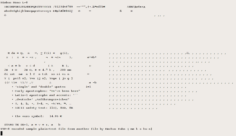
Unfortunately, as you can see, Nimbus Mono L has quite bad problems
with using too much vertical space, and has a quite small character
repertoire.

>>  I have the same issue in text editors: the number of lines that
>>  can be displayed is crucial.
>
> That is an interesting viewpoint, and I take it seriously.
> But once again, compactness isn't the main goal of this project.

Well, I will continue to seek a font with decent Unicode coverage
(including the Greek alphabet, math symbols, superscripts, subscripts,
and combining accents) that displays nicely in a terminal window.

--
Joe
- [Freefont-bugs] a comparison of FreeMono.ttf versions of 2003-06-24 and 2008-03-24, Joe Wells, 2008/04/03
- Re: [Freefont-bugs] a comparison of FreeMono.ttf versions of 2003-06-24 and 2008-03-24, James Cloos, 2008/04/08
- [Freefont-bugs] Re: a comparison of FreeMono.ttf versions of 2003-06-24 and 2008-03-24, Joe Wells, 2008/04/08
- Re: [Freefont-bugs] Re: a comparison of FreeMono.ttf versions of 2003-06-24 and 2008-03-24, James Cloos, 2008/04/10
- Re: [Freefont-bugs] a comparison of FreeMono.ttf versions of 2003-06-24 and 2008-03-24, Steve White, 2008/04/09
- Re: [Freefont-bugs] a comparison of FreeMono.ttf versions of 2003-06-24 and 2008-03-24, James Cloos, 2008/04/09
Re: [Freefont-bugs] a comparison of FreeMono.ttf versions of 2003-06-24 and 2008-03-24, Steve White, 2008/04/05