[Top][All Lists]
[Date Prev][Date Next][Thread Prev][Thread Next][Date Index][Thread Index]
Re: [Freetype] Arial ttf - bad rendering of some glyphs
|
From: |
Vadim Plessky |
|
Subject: |
Re: [Freetype] Arial ttf - bad rendering of some glyphs |
|
Date: |
Thu, 12 Jul 2001 15:03:42 +0000 |
On Thursday 12 July 2001 10:43, Boris Letocha wrote:
| From my point of view ALL characters looks beatiful ... Pretty good work
| from FT. If you don't want *dirty* than switch AA off.
You, probably, misunderstood me.
I am not saying that FT is bad. Almost all characters are rendered very good,
indeed. And FT is a Good Thing (tm).
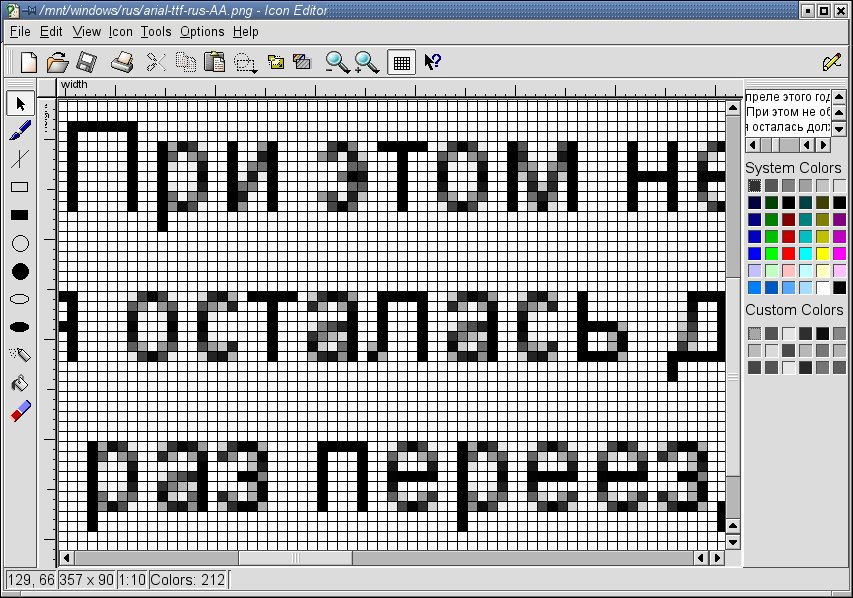
Look at magnified version of screenshot - it's visible that there are some
rendering artefacts in several letters (see my previous mail)
There is a room for improvement.
(and you can see from attached screenshot that some gray ponts can be
eliminated, restoring original char form and improving visual perception)
|
| Boris Letocha
--
Vadim Plessky
http://kde2.newmail.ru (English)
33 Window Decorations and 6 Widget Styles for KDE
http://kde2.newmail.ru/kde_themes.html
Do you have Arial font installed? Just test it!
http://kde2.newmail.ru/font_test_arial.html
 arial-ttf-magnified.png
Description: magified version of screenshot