[Top][All Lists]
[Date Prev][Date Next][Thread Prev][Thread Next][Date Index][Thread Index]
Re: WANTED: Design for documentation (Photoshop power users!)
|
From: |
Robin Bannister |
|
Subject: |
Re: WANTED: Design for documentation (Photoshop power users!) |
|
Date: |
Sun, 5 Oct 2008 04:11:07 +0200 |
Patrick McCarty wrote:
Okay, see if this design looks better:
...
What do you think?
Well, I ought to be asleep.
But that hasn't worked out too well yet.
I realised I had messed up my last two posts (png uncompressed)
and got back online to patch things up a bit.
What do you think?
Well, I'm honoured.
And you are very quick off the mark.
In fact, you are away ahead of the others,
doing "higher than top" and "GNU Lilypond -" elision
just like that. :)
What do you think?
Yes, well the smoke has thinned a little.
Look,
when this thread started I thought
I might keep an eye on what happened to the navigation,
but I would keep well away from the styling stuff.
But it's not working out that way.
So, to styling:
I'm older than the other Patrick [1] and don't take to any darkish background.
But what I think is more radical than your rework:
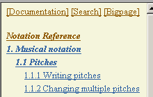
G
The TOC panel needs no title area (I'm repeating myself)
H
The TOC panel and the navigation bars should be the same colour
to show the user their similarity in affordance:
- they show you where you are and where you can go to
- they are packed full of things to click on
- unlike the main page they have no sentences/paragraphs/etc
So the TOC panel is (e.g.) pale yellow all over. Navigation bars too.
And yes, the "higher than top" link is up there above the toc (E in [2]).
And there may be room for some other links (left unexplained),
as shown in the attached (compressed) png.
[1] http://lists.gnu.org/archive/html/lilypond-user/2008-10/msg00001.html
[2] http://lists.gnu.org/archive/html/lilypond-user/2008-09/msg00770.html

Cheers,
Robin
 TOCroot.png
Description: PNG image
- Re: WANTED: Design for documentation (Photoshop power users!), (continued)
- Re: WANTED: Design for documentation (Photoshop power users!), Patrick Horgan, 2008/10/01
- Re: WANTED: Design for documentation (Photoshop power users!), Neil Puttock, 2008/10/01
- Re: WANTED: Design for documentation (Photoshop power users!), Robin Bannister, 2008/10/04
- Re: WANTED: Design for documentation (Photoshop power users!), Patrick McCarty, 2008/10/04
- Re: WANTED: Design for documentation (Photoshop power users!), Patrick McCarty, 2008/10/04
- Message not available
- Re: WANTED: Design for documentation (Photoshop power users!), Patrick McCarty, 2008/10/04
- Re: WANTED: Design for documentation (Photoshop power users!),
Robin Bannister <=
- Re: WANTED: Design for documentation (Photoshop power users!), Patrick McCarty, 2008/10/09
- Re: WANTED: Design for documentation (Photoshop power users!), Andrew Hawryluk, 2008/10/09
- Re: WANTED: Design for documentation (Photoshop power users!), Patrick McCarty, 2008/10/09
- Re: WANTED: Design for documentation (Photoshop power users!), Brett Duncan, 2008/10/09
- Re: WANTED: Design for documentation (Photoshop power users!), Valentin Villenave, 2008/10/10
- Re: WANTED: Design for documentation (Photoshop power users!), Robin Bannister, 2008/10/10
- Re: WANTED: Design for documentation (Photoshop power users!), Patrick McCarty, 2008/10/31
- Re: WANTED: Design for documentation (Photoshop power users!), Valentin Villenave, 2008/10/31
- Re: WANTED: Design for documentation (Photoshop power users!), Patrick McCarty, 2008/10/31
- Re: WANTED: Design for documentation (Photoshop power users!), Robin Bannister, 2008/10/31