Description: PNG image
|
| From: | Robin Bannister |
| Subject: | Re: WANTED: Design for documentation (Photoshop power users!) |
| Date: | Fri, 10 Oct 2008 12:33:21 +0200 |
I've created another design with a color palette that passes the W3C Web Content Accessibility guidelines for color contrast
Yes, yes, yes! Thank you very much. At last I feel the web designer was more concerned about making it easy to read rather than easy to look at. And on long hunts in these extensive docs, easy to read is easy on the eye. Yes please.
I like #006078 a lot. It blends with the other colors very well.
Well, exactly. It blends. An enormous loss of contrast. The Brett's #0030B8 and Andrew's #1a1aaa seem much the same to me. The reduction in contrast is such that - on white, the links are not quickly distinguishable from ordinary text. - the TOC font would need to be larger to achieve the clarity of #0308fc.
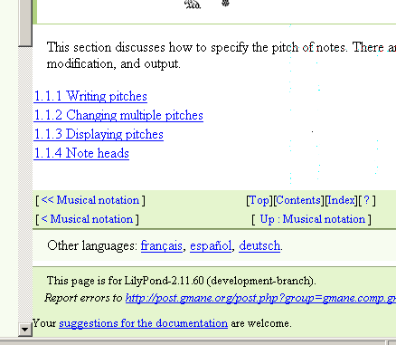
And the backgrounds work well in their context. I feel sufficient coordination is achieved without being obtrusive. I do have one caveat though. The bottom navbar and the footer now have the same backgound. They are indeed separated by a gap, but this is insufficient. When you scroll to the bottom of a page and see these appear, the navbar is not so easily recognised as such, i.e. you don't immediately see that it is the same thing as was up at the top. Rather than invoke an additional footer colour, I suggest that the language bar be moved up, and thus act as a more effective gap. Something like footer.png.
Cheers,
Robin
![]() footer.png
footer.png
Description: PNG image
| [Prev in Thread] | Current Thread | [Next in Thread] |