[Top][All Lists]
[Date Prev][Date Next][Thread Prev][Thread Next][Date Index][Thread Index]
Re: Lighter appearance
|
From: |
Francisco Vila |
|
Subject: |
Re: Lighter appearance |
|
Date: |
Fri, 14 Nov 2008 21:50:01 +0100 |
2008/11/14 Johan Vromans <address@hidden>:
> Hi,
>
> While comparing the LilyPond gegerated output with the output of a
> competitor program, I noticed that the LP outout is much 'heavier'.
>
> See e.g., http://www.squirrel.nl/pub/xfer/lilsib.jpg .
>
> The top line is from LilyPond, the bottom line is from a Sibelius
> printout. I think the larger noteheads in combination with the thinner
> lines make the score easier to read.
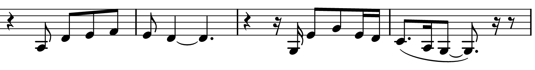
This is not the default output of LilyPond. I have tried to reproduce
your example and it is clearly better, bolder and more readable than
the bottom sibelius example for my eyes. See attached PNG
--
Francisco Vila. Badajoz (Spain)
http://www.paconet.org
 test.png
Description: PNG image
Re: Lighter appearance, David Rogers, 2008/11/17