Description: PNG image
|
| From: | Frank Steinmetzger |
| Subject: | Two questions about vertical layout and lyrics spacing |
| Date: | Sat, 17 Mar 2012 21:31:10 +0100 |
| User-agent: | Mutt 1.5.21 (2010-09-15, Gentoo 1.5.21-r1) |
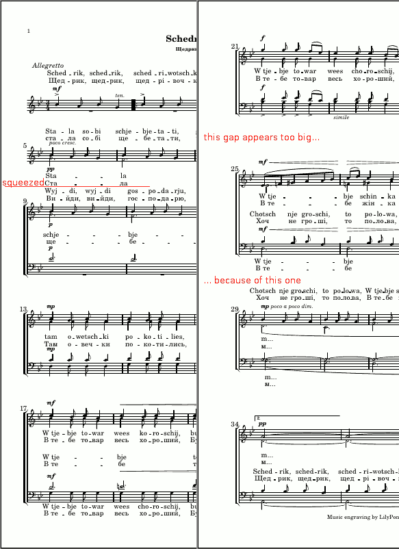
Hello dear gurus

I'm progressing steadily in my migration efforts from 2.12 to 2.14. In the
bigger part of cases, the new vertical layout of 2.14 shows to be superior and
easier to handle.  However, I have a bit of doubt about some of its aspects.

Please see the attached screenies for two examples.


The first one, lyrics.png, shows a page created by both 2.12 and 2.14.  Thanks
to the smaller space between a staff and its lyrics, the systems now become
less high.  This is often a good thing, as it allows to get more on a page.
However, this is one of the cases where it leads to a lot of empty room
between system.  What would be a good way to make the overall appearance a bit
lighter by un-squeezing the systems?

Essentially, I would like to make the basic line height of lyrics a bit
bigger, while retaining the small minimum-height and keeping stretchability of
the padding around lyrics the same as that of system-system-spacing, so it's
a proportional stretching.


Example #2, padding.png, shows a piece which has a large variation in staff
height, because there are either two lines of lyrics to a staff or none at
all.  As lilypond tries to keep an even system-system-distance, the result is
now that the first two systems on the first page are so tight together that it
is hard to make out which text belongs to which staff.
The second page shows a similar, if not as extreme, effect; systems 2 and 3
are rather heave with all their lyrics, but they appear closer together than
the less heavy systems 1 and 4 to their respective neighbours.

My first thought is now of course to alter system-system-spacing #'padding,
but I have not found a way to make this equal between all systems on one page
(except if I enabled ragged-bottom).  What would you recommend?


I know lilypond adheres strongly to some long-evolved engraving standards, yet
the described pages look unbalanced to me.  So I'd apreaciate your (corrective)
insight.
--
Gruß | Greetings | Qapla'
I forbid any use of my email addresses with Facebook services.

“Privacy laws are our biggest impediment to us obtaining our
objectives.” — Michael Eisner, CEO of Disney, 2001
![]() lyrics.png
lyrics.png
Description: PNG image
![]() padding.png
padding.png
Description: PNG image
![]() pgpQPtdE6eP0y.pgp
pgpQPtdE6eP0y.pgp
Description: PGP signature
| [Prev in Thread] | Current Thread | [Next in Thread] |