[ATTENTION: INLINE IMAGES] Thanks Werner ;-)
LilyPond tries to mimick traditional engraving. There are bugs,
however, saying "I find xx is too short" is not helpful.
I thought I was fairly clear about the specifics—“I find the stem here awfully short because it makes the flag on the eighth note run into the note heads”—but I guess not. But the inline images (yes) shown below should resolve any confusion on the point.
But I didn't mean to imply that it was a bug. I figured the default behavior was purposeful and I simply had a difference of opinion and wanted to know how to change it for what I am doing.
Please find a piece of beautiful engraving and compare that with
LilyPond to see if you found a bug, and show us.
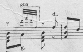
Well, here is the original I am working with, which looks good to me:
And here is Lilypond's output:
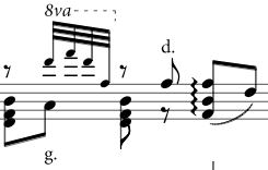
Note the chord in the middle of both images. The engraved piece has a clear and distinct stem and flag that look, well, purposeful. Lilypond’s default output, by comparison looks compressed and there is an awkward (to me) collision of flag and note heads that leaves the flag much less visually distinct. The fis above (under the "d.") also looks strange to me in Lilypond, with the arc of the flag running past the head and pointing to space, while the engraved example looks graceful with the arc of the flag pointing nicely to the head, thus visually reinforcing the location of the note.
With the tweaks to the stem shortening suggested by Keith, I get this:

The chord looks MUCH better to me and which is closer to the old engraving (although the other note isn't changed and I will probably have to manually adjust it, which is not a big deal). I know which I would prefer as a performer reading the score.
There is likely to be divergence of opinion on these matters, however, and I respect that.
If you cannot find it, you may consider revising your taste regarding
the issue.
Well, it was trivial work of just a few minutes to find an example that I find aesthetically more pleasing than Lilypond’s default (and that highlights the issue), so I guess I don't need to revise my taste ;-) There are many things I *dislike* about the original engraving of the piece in question (it is cramped and unclear in many aspects), ones where I think Lilypond is much better, but the flags here are not one of them.
But again, I'm not (and wasn't) asking for Lilypond to change. I was pointing to an issue I found and asking how to resolve it *for me*. I wouldn't (and didn't) call this a bug. I assumed it was a difference of taste. However, since it was already filed as a bug by Karol Majewski, I will comment on that bug report. Since I have my needed fix for today though, it doesn't bother me if the default behavior doesn't change and people prefer it the way it is.
Best,
Arle