Description: JPEG image
|
| From: | Pierre Perol-Schneider |
| Subject: | Re: LilyPond logo? |
| Date: | Thu, 4 Aug 2016 13:17:21 +0200 |
Am 03.08.2016 um 18:07 schrieb Pierre-Luc Gauthier:
2016-08-03 11:03 GMT-04:00 Andrew Bernard <address@hidden>:
The concept is fine I am sure, but the execution difficult, and acceptance
problematical.
I know it’s difficult but does that mean one cannot try?
Logo design is fraught with difficulty, and you will inevitably end up with
something half the population does not like.
I think that might be realistic but not problematic. If someone doesn’t like the logo, they don’t have to use it; of course it would be nice to have something that is at least acceptable for most people.
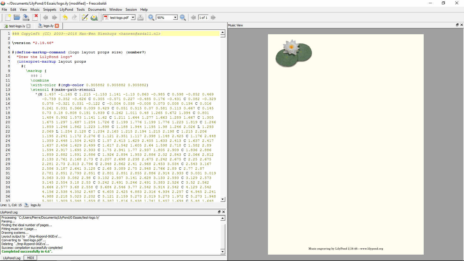
And this argument works also for the current logo (an image of a waterlily flower, two leaves, and a score in the background): It’s a nice picture, but I don’t like it as a logo because it cannot be used in print (at least in small sizes).
I agree,
but since there already *is* a logo,
wouldn't it be acceptable to "simply" make it a b/w vectorialised
version of it?
That would be nice but I doubt one can make a convincing b/w version of that. Even if you leave out the background it’s a very complex image. And even if you manage to make a b/w version of that it’s not usable at small sizes.
_______________________________________________
lilypond-user mailing list
address@hidden
https://lists.gnu.org/mailman/listinfo/lilypond-user
![]() test-logo.jpg
test-logo.jpg
Description: JPEG image
| [Prev in Thread] | Current Thread | [Next in Thread] |