[Top][All Lists]
[Date Prev][Date Next][Thread Prev][Thread Next][Date Index][Thread Index]
emacs icon - ugh!
|
From: |
Drew Adams |
|
Subject: |
emacs icon - ugh! |
|
Date: |
Sat, 5 Apr 2008 12:41:07 -0700 |
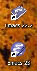
I didn't realize that we had actually changed the Emacs icon for Emacs 23. There
was some discussion, but I didn't get the impression there was much discussion
or any decision.

Anyway, FWIW, I think the new icon is quite a bit inferior to the Emacs 22 icon.
Attached is a screenshot of them both on my desktop. I have a hard time
believing that anyone prefers the new one.

Even at the giant size of these desktop icons, the "pen" looks like just a
graphics mistake. There is no clear outline, so at least in a context such as
this, it doesn't stand out. The "3D" highlighting just makes it look, well,
fuzzy and washed out. In its favor, the "E" formed by the gnu horns is more
clearly an "E" (and less clearly horns).

Anyway, this is not a biggee, but JFTR I preferred the previous one.
 throw-emacs-icons.png
Description: PNG image
- emacs icon - ugh!,
Drew Adams <=