[Top][All Lists]
[Date Prev][Date Next][Thread Prev][Thread Next][Date Index][Thread Index]
flags, beams and stem length in forced directions - output improvement
|
From: |
Janek Warchoł |
|
Subject: |
flags, beams and stem length in forced directions - output improvement |
|
Date: |
Mon, 27 Dec 2010 13:45:43 +0100 |
Hi all,
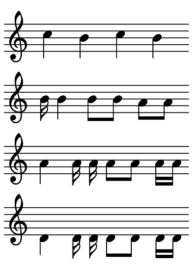
There is a problem with LilyPond default output that i want to
discuss. Look at the attachment1:
- in the first line: the stems of the b's are too short,
- in the second and third line: the beams of the 'a' eight notes are too high,
- in the fourth line: the 16th flags look bad.
http://tinypic.com/r/9rhr2v/7 shows how things could be done better.
All this may sound nitpicky, but at least the first one is quite
serious - and it affects virtually all scores!
These problems are connected and a proper solution should be a
comprehensive one. I've analyzed the situation and divided it into a
list of consecutive questions; i'll post them one by one in this
thread.
Afterwards i'll gladly help with making a patch reflecting our decisions.
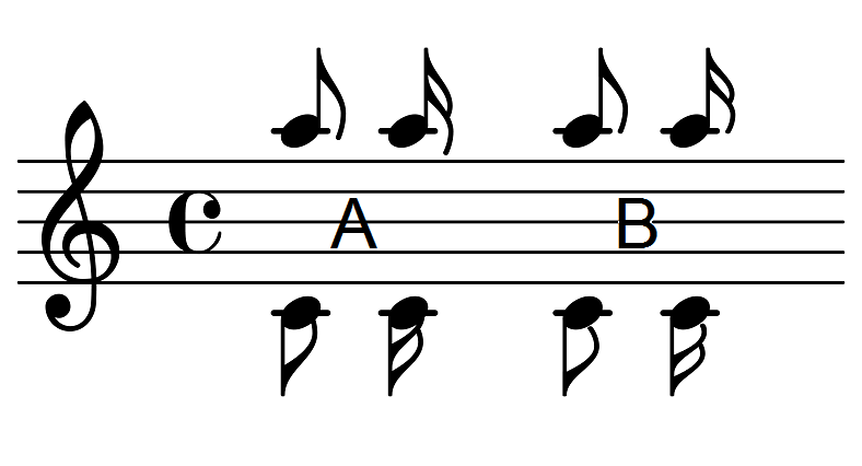
The first question is: we all know that stems in forced directions
(like this one: { \clef treble \stemUp a'' } ) should be shortened,
but what shall LilyPond do when there is a flag attached to such short
stem? (see attachment2):
(A) don't do anything (current behaviour),
(B) make the flag shorter. Adding shorter versions of the flags to the
font would be great, but very laborous. Simply scaling the flags
vertically, as i did manually to create the attachment, seems to work
quite fine (i hope it's possible with LilyPond).
I strongly prefer changing the default behaviour to B because:
- the flags look much better,
- it allows for shorter flagged stems*.
*regular stem length is 3.5 staff space, while 2.5 is the length for
shortened stems. Unfortunately unchanged downward 16th flags start
looking bad at 3.1 stem length, while shortened flags look acceptable
even at 2.7 stem length (and if we'd add shorter versions of the flags
to the font, i suppose they would look great even at 2.5 and below!).
I'll post the next question as soon as we decide on this.
I'm looking forward to reading your answers,
Janek
PS What about 32nd, 64th and 128th flags? I think it'll be obvious
what to do with them after we decide about 8th and 16th notes.
 attachment1.png
Description: PNG image
attachment2.png
Description: PNG image
- flags, beams and stem length in forced directions - output improvement,
Janek Warchoł <=
- RE: flags, beams and stem length in forced directions - output improvement, James Lowe, 2010/12/27
- Re: flags, beams and stem length in forced directions - output improvement, Janek Warchoł, 2010/12/27
- Re: flags, beams and stem length in forced directions - output improvement, Carl Sorensen, 2010/12/27
- Re: flags, beams and stem length in forced directions - output improvement, Janek Warchoł, 2010/12/27
- Re: flags, beams and stem length in forced directions - output improvement, Carl Sorensen, 2010/12/27
- Re: flags, beams and stem length in forced directions - output improvement, Janek Warchoł, 2010/12/27
- Re: flags, beams and stem length in forced directions - output improvement, Carl Sorensen, 2010/12/27
- Re: flags, beams and stem length in forced directions - output improvement, Janek Warchoł, 2010/12/27