[Top][All Lists]
[Date Prev][Date Next][Thread Prev][Thread Next][Date Index][Thread Index]
Ugly volta brackets
|
From: |
Dominic Neumann |
|
Subject: |
Ugly volta brackets |
|
Date: |
Mon, 12 Mar 2007 17:17:52 +0100 |
Hi,
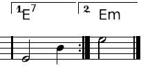
when using volta brackets together with chordnames it doesnt look good to me.
There are three problems:
1.) The font of the bracket numbers (1., 2., ...) doesnt look good. I
want it to be the same font as the one that is used for chordnames. In
addition the baseline of the chordnames should be the baseline of the
bracket numbers to look good.
2.) The vertical lines of the volta brackets should also go down to
the baseline of the chordnames.
3.) At the right end of volta bracket there´s no vertical line. Why?
I´ve added two images to this mail:
vbbad.jpg shows the current situation produces by lilypond
vbgood.jpg shows an example from printed music that looks good to me.
Any suggestions?
Thanks,
Dominic
 vbbad.jpg
Description: JPEG image
vbgood.jpg
Description: JPEG image
- Ugly volta brackets,
Dominic Neumann <=