[Top][All Lists]
[Date Prev][Date Next][Thread Prev][Thread Next][Date Index][Thread Index]
Re: shortened flags affair, part 3 - 32nds stem length
|
From: |
Janek Warchoł |
|
Subject: |
Re: shortened flags affair, part 3 - 32nds stem length |
|
Date: |
Sat, 5 Mar 2011 12:42:09 +0100 |
Carl, Han-Wen, Werner, Trevor,
thanks for swift answers!
2011/3/5 Han-Wen Nienhuys <address@hidden>
>
> > Therefore i call for shortening 32nd unbeamed notes by 0.25 ss. Do you
> > agree?
>
> SGTM - I don't think we ever put this much thought or analysis into
> the numbers we put there.
:) I'm going to do more such analysis :)
2011/3/5 Werner LEMBERG <address@hidden>:
>
>> i suggest making unbeamed 32nd stems a bit shorter than they are
>> now. The main reason for doing so is to better match the stem
>> length of the beamed notes.
>
> While I generally agree with your suggestions, I'm not sure that it is
> the right solution. In many of the `red' cases of the `old' image, I
> think that the length of the unbeamed 32nd stems are fine, but the
> length of the beamed stems you are comparing to are too short. To be
> more precise, I would increase the minimum stem length for beamed
> 32nds so that the beams snap to the next, more distant staff line.
>
> Have you played with that also?
No, but i did it now (by inserting \override Stem #'details
#'beamed-lengths = #'(3.5 3.5 4.25) in line 21 of that proof-sheet,
compiled proof-sheet with colors is here:
http://www.sendspace.com/file/4ch1mg).
The effects are quite what i expected - it introduces a lot of yellow
and in my opinion starts looking weird in some places. Because of beam
quanting, virtually all changes are of a whole staffspace, and it
looks like too much, see "too high.png" - i prefer shorter stems in
this case.
However, i'm not familiar with internal workings of beam quanting -
maybe changing some parameters would improve the situation without
introducing new problems.
By the way, what do engraving books say about it?
2011/3/5 Trevor Daniels <address@hidden>
> I was surprised to see the quite wide variation in the lengths
> of the beamed 32nd notes. Some seem too long and some
> too short.
I agree that they look somewhat inconsistent.
> By that I mean moving them to the next quan position
> to make them shorter or longer respectively would seem to be
> an improvement. I wonder if the default quanting parameters
> are optimally tuned. Perhaps this should be investigated first?
As we have seen above, simply changing beamed-lengths doesn't work very well.
In my opinion we should decrease the length of unbeamed 32nds as i
suggested, and also lenghten some beamed ones, but not by a whole
staffspace.
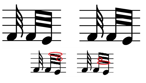
For example look at the "some improvement.png". Current beam behaviour
is on the left, and the beamed stems are too short there (and the
unbeamed stem is shortened there by 0.25 ss as i suggested). On the
right is my idea of fixing this. The trick is that the version on the
right has exactly the same quanting problems, but they appear in the
lower part of the beam instead of the upper part. Somehow LilyPond
never uses this solution.
Implementing this would fix 8 out of 18 oranges, and i have ideas how
other oranges could be improved as well.
>> (red - unbeamed stem is 1 staffspace longer than beamed stem, orange - 0.75
>> staffspace longer)
>> As you can see, there is quite a lot of red and orange there.
>> Now what would it look like if we changed the length of the unbeamed 32nd
>> notes to 4.25 ss (instead of 4.5)? Look here:
>> http://www.sendspace.com/file/2mzt4a
>> Looks much better to me - no red, only orange. Unfortunately it introduces
>> some yellow (unbeamed stem shorter than beamed one), but it's just a little.
>
> Agreed, irrespective of my comments on quanting above. Increasing
> the length of the very short beamed 32nds would remove some red,
> but reducing the length of the very long ones would introduce more,
> or at least more orange.
Exactly.
So, should i Prepare the Patch (it would be really tiny :D)?
cheers,
Janek
 too high.png
Description: PNG image
some improvement.png
Description: PNG image
- shortened flags affair, part 3 - 32nds stem length, Janek Warchoł, 2011/03/04
- Re: shortened flags affair, part 3 - 32nds stem length, Carl Sorensen, 2011/03/04
- Re: shortened flags affair, part 3 - 32nds stem length, Han-Wen Nienhuys, 2011/03/04
- Re: shortened flags affair, part 3 - 32nds stem length, Werner LEMBERG, 2011/03/04
- Re: shortened flags affair, part 3 - 32nds stem length, Trevor Daniels, 2011/03/05
- Re: shortened flags affair, part 3 - 32nds stem length,
Janek Warchoł <=
- Re: shortened flags affair, part 3 - 32nds stem length, Janek Warchoł, 2011/03/08
- Re: shortened flags affair, part 3 - 32nds stem length, Trevor Daniels, 2011/03/08
- Re: shortened flags affair, part 3 - 32nds stem length, Graham Percival, 2011/03/09
- Re: shortened flags affair, part 3 - 32nds stem length, Janek Warchoł, 2011/03/09
- Re: shortened flags affair, part 3 - 32nds stem length, address@hidden, 2011/03/09
- Re: shortened flags affair, part 3 - 32nds stem length, address@hidden, 2011/03/09