Description: PNG image
|
| From: | Janek Warchoł |
| Subject: | Re: shortened flags affair, part 4 - downstem 8th flag |
| Date: | Sun, 6 Mar 2011 10:44:16 +0100 |
2011/3/6 Carl Sorensen <address@hidden>:
>
> On 3/5/11 6:54 PM, "Janek Warchoł" <address@hidden> wrote:
>>
>> I was curious too, so i wrote it down.
>> Indeed it looks like he used non-default layout (by default Lily uses
>> 3 systems), but i won't call it non-optimal. In my opinion fitting
>> this music in two systems is perfectly reasonable here (and maybe even
>> better than spreading over 3 systems), and Lily should be able to
>> execute this flawlessly.
>> Unfortunately, measure 6 still looks bad. It's not as spectacular as
>> in his pdf, but i won't said its acceptable at all. It's a shame
>> especially because this problem is something in which Finale (2008)
>> excels (see attachment).
>
> I don't see what you mean in your attachment. I see lots of places where
> the notes in the attachment are *much* closer to the barlines than in the
> current LilyPond output.
Ugly, aren't they? (and my choir uses this score... brr...)
I meant that Lily 2.10.33 delivered similarly bad output. Of course
2.13 output is much better, but still not perfect, and that's also
what i meant.
>> Still, even not counting this, he undoubtedly proved - with some very
>> simple music - that LilyPond 2.10.33 failed to produce acceptable
>> output :(
>
> So I compared his 2.10.33 output with the current 2.13.53.
>
> Here are the things he didn't like:
>
>> Errors I can spot:
>> bar 1: dynamic to far to the right
>
> Still there, I suppose. I'd like to see what he considers "just right".
perhaps attached code does what he want.
It's because of optical illusion, like in optical spacing. Forte sign
visual centerline is moved, perhaps due to 2 factors:
- character is slanted
- there is a slash across it, which focuses viewer's attention. And
because of slant this slash is not centered.
See attachment.
(and the tenuto sign above forte helps to see this effect more strongly)
>> Bb - to short stem (throughout)
>
> Perhaps. It's consistent with Read. But thanks to your fix, that's now
> fixed in 2.13.53.
:)
>> flags (incorrect notation, just to test commands) to close to notehead when
>> notehead is in a space.
>
> The concept you're currently working on. If we agree to accept your
> changes, that concern will go away.
hopefully :)
>> bar 6: final note WAY to close to barline.
>
> Now only slightly too close to barline. Should probably be filed as a bug.
> I don't know why the last note in measure 6 is closer to the barline than
> any other note in the piece. I assume it's because of the time signature
> change.
Yeah, it looks so.
> Indeed, if I eliminate the time signature change the spacing is improved.
> I'll see if I can make a Tiny Example.
This seems to work:
{
\repeat unfold 8 { a' a' a' a' } \break
\repeat unfold 5 { \time 5/4 c' c' c' c' c' }
}
I'll send this to bugs.
>> bars 7,8,9: cresc/dim and axpressions - bad allignment.
>
> Perfectly aligned now.
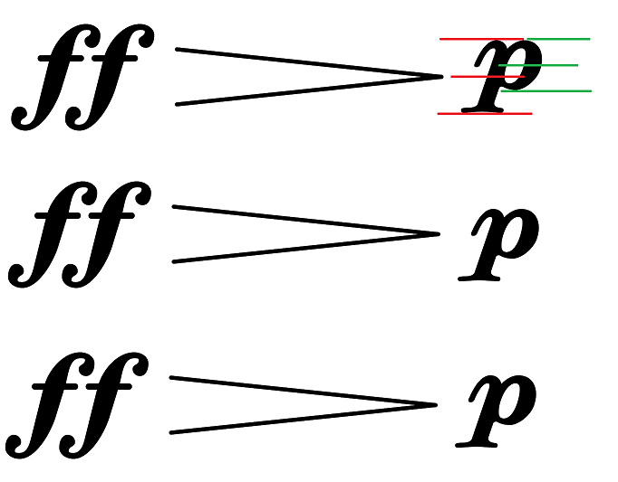
Almost perfectly - piano sign is too high, at least in my opinion.
Again the centerline is wrong, but this time not due to visual trick.
It's because the centerline shouldn't take the tail of the letter into
account, see attachment.
Actually, maybe a compromise between current behaviour and totally
ignoring the tail would be best (see third line in that attachment).
I was going to suggest changing this after finishing with shortened flags.
>> bars 8,9,11: ugly slurs, bad placement in bar 8
>
> I agree with 9 and 11 having ugly slurs -- too sharply peaked.
>
> I've changed the slur scoring so that it doesn't try to move slurs away from
> staff lines. It cleans up the ugly slurs, at the expense of letting the
> slurs touch the line. I've attached a pdf with those changes.
Looks great!
And in fact these slurs don't touch staff lines, there is a small
clearance. I printed it and it looks ok (however, my printer prints
*very* badly and shaky now, so it should be double-checked).
> I don't think 8 is an ugly slur, or that the placement is bad. Can you tell
> me what is ugly about it, and why the placement is bad?
I'm not sure. Perhaps the left end is too high. I attach output from
finale 2008 demo, i'd say that something between this and current Lily
output would be optimal.
>> bar 12: accidental touching slur.
>
> If we let it go to 3 systems, it doesn't touch. If we force it to 2, it
> does.
>
> After changing the move from staff line slur scoring, the collision goes
> away.
...however, the slur gets horizontal.
Personally i preferred slur touching the accidental. The optimal
solution would perhaps see be to have slur not touching the
accidental, but still being sloped. Or shortening the flat symbol just
a little bit (smaller variations off accidental for use in tight
situations is something i'm going to suggest).
> What do you think about this new layout?
Other than what i pointed above, i like it :)
2011/3/6 Trevor Daniels <address@hidden>:
>
> Janek Warchoł wrote Sunday, March 06, 2011 1:54 AM
>> I was curious too, so i wrote it down.
>> Indeed it looks like he used non-default layout (by default Lily uses
>> 3 systems), but i won't call it non-optimal. In my opinion fitting
>> this music in two systems is perfectly reasonable here (and maybe even
>> better than spreading over 3 systems), and Lily should be able to
>> execute this flawlessly.
>> Unfortunately, measure 6 still looks bad. It's not as spectacular as
>> in his pdf, but i won't said its acceptable at all. It's a shame
>> especially because this problem is something in which Finale (2008)
>> excels (see attachment).
>
> Finale certainly excels at the problem; pity about its solution!
> Nice to see some irony!
Have you noticed that alto's first note aligns with other voices,
while it shouldn't?
That's perhaps even more awful.
>> Still, even not counting this, he undoubtedly proved - with some very
>> simple music - that LilyPond 2.10.33 failed to produce acceptable
>> output :(
>
> Yes, but Carl is on to it.
>
> Optimising the slur shapes is a similar problem to optimising beam
> positions. Collecting currently poor examples in a reg test is a good
> starting point for optimising both of these.
;D
cheers,
Janek
![]() finale slur.png
finale slur.png
Description: PNG image
![]() piano centerlines.png
piano centerlines.png
Description: PNG image
![]() forte centerlines.png
forte centerlines.png
Description: PNG image
![]() promenade forte.ly
promenade forte.ly
Description: Binary data
| [Prev in Thread] | Current Thread | [Next in Thread] |