[Top][All Lists]
[Date Prev][Date Next][Thread Prev][Thread Next][Date Index][Thread Index]
Re: [ft-devel] ttfautohint: How to install
|
From: |
Werner LEMBERG |
|
Subject: |
Re: [ft-devel] ttfautohint: How to install |
|
Date: |
Tue, 21 Jun 2011 15:33:38 +0200 (CEST) |
> the new screenshots are posted at
> http://newtypography.co.uk/ttfauto/
Thanks!
> there's still some 'curve flattening' at large sizes, but less
> marked now. I will post some full waterfall tests later today to
> check all point sizes up to 48 ish.
The reason for the difference is an incredibly aggressive vertical
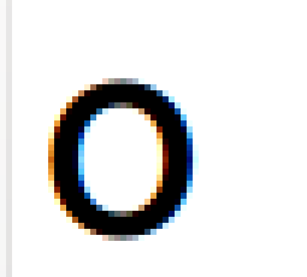
filtering with GDI, I believe. Have a look at the attached images to
compare how ftview and Win98's GDI render glyph `o' from the
ttfautohint version of the Ubuntu font:
Ubuntu-R-TA-o-48px-1.0gamma-ftview.png
Ubuntu-R-TA-o-48px-Win98-GDI-Chrome12.png
GDI apparently paints horizontally isolated pale pixels as white, and
blackens isolated dark pixels. I consider this plain ugly. At 48px,
the glyphs in the top waterfall (Win98 GDI rendering) on the above web
page look as if they had been rendered without anti-aliasing...
The FontForge snapshots demonstrate how the hinted outlines differ
between the original hinting in Ubuntu (Ubuntu-R) and the ttfautohint
version (Ubuntu-R-TA):
Ubuntu-R-TA-o-48px.png
Ubuntu-R-o-48px.png
As you can see, the ttfautohint intentionally aligns the hinted
outline (green) at half-pixel borders, making it almost the same shape
as the unhinted outline (black). On the other hand, the original
Ubuntu hinting is far more aggressive even at that large size,
rounding to integer pixel values.
Werner


Re: [ft-devel] ttfautohint: How to install, vernon adams, 2011/06/20
Re: [ft-devel] ttfautohint: How to install, Werner LEMBERG, 2011/06/20
Re: [ft-devel] ttfautohint: How to install, vernon adams, 2011/06/23
Re: [ft-devel] ttfautohint: How to install, vernon adams, 2011/06/29
Re: [ft-devel] ttfautohint: How to install, Werner LEMBERG, 2011/06/30
Re: [ft-devel] ttfautohint: How to install, vernon adams, 2011/06/30
Re: [ft-devel] ttfautohint: How to install, vernon adams, 2011/06/30
Re: [ft-devel] ttfautohint: How to install, Werner LEMBERG, 2011/06/30