[Top][All Lists]
[Date Prev][Date Next][Thread Prev][Thread Next][Date Index][Thread Index]
Re: WANTED: Design for documentation (Photoshop power users!)
|
From: |
Robin Bannister |
|
Subject: |
Re: WANTED: Design for documentation (Photoshop power users!) |
|
Date: |
Mon, 6 Oct 2008 23:44:04 +0200 |
Kurt Kroon wrote:
the CSS "quasi-frames" already provide the affordance of a fixed navigation
frame, so it isn't necessary to make their backgrounds "matchy-matchy".
I don't understand which background areas you are referring to.
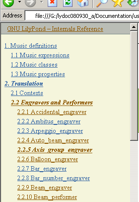
By "navigation bars" I was referring to the horizontal stripes where you can
click to go up or along.
These are embedded in the main pane; they move with it when you scroll.
Yes, the TOC panel is fixed in this way.
If you arrive at a web page with
- a list of things in a vertical strip on the left
you would probably expect this to be for navigation.
If, additionally,
- the things are shortish and more or less regularly arranged
- there is not much else, e.g. no long sentences
it becomes that much more likely.
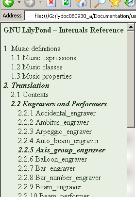
The TOC panel fits this very well.
The links in our ... designs provide affordance of
clickability by being underlined
I suggest that as long as the TOC panel (or whatever) is easily recognised
as being for navigation there is no need to indicate clickability.
See also [1].
In fact, I think the TOC has too many sorts of indications at the moment.
Unlike the main pane, it is not for normal reading, but for scanning:
eyewise, you zoom out a bit and apply a sort of filter.
This filter gets bogged down by the underlining and the different colours.
Scanning is slower and takes more effort.
And you can no longer see the breadcrumbs at a glance.
They are indeed italic and bold, but
- their unity is broken (they can differ in colour)
- they do not stand out (they are mottled in mottled surroundings).
Which means I'm going against a Nielsen thing - the colouring of visited links.
But he is mostly concerned with sporadic visits to typical web sites.
This corresponds to use cases like:
- somebody working through LM for the first time
- after a new stable release somebody reads through AU again.
But the main doc usage is surely referring to NR/IR(/LM) to solve problems.
And here, the history of yesterdays problem is still prominent when consulting
the docs about today's different problem. There is a masking, and after a
few such consultations "visited" has lost its effectiveness.
So as far as links in the navigation areas are concerned,
I think something like the old styling is the way to go.
[1] http://lists.gnu.org/archive/html/lilypond-user/2008-09/msg00511.html


Cheers,
Robin
 current.png
Description: PNG image
previous.png
Description: PNG image
- Re: WANTED: Design for documentation (Photoshop power users!), (continued)
- Re: WANTED: Design for documentation (Photoshop power users!), Alexander Kobel, 2008/10/07
- Re: WANTED: Design for documentation (Photoshop power users!), Alexander Kobel, 2008/10/07
- Re: WANTED: Design for documentation (Photoshop power users!), Brett Duncan, 2008/10/08
- Re: WANTED: Design for documentation (Photoshop power users!), Kurt Kroon, 2008/10/11
- Re: WANTED: Design for documentation (Photoshop power users!), Patrick McCarty, 2008/10/11
Re: WANTED: Design for documentation (Photoshop power users!), Robin Bannister, 2008/10/18
Re: WANTED: Design for documentation (Photoshop power users!), Mark Polesky, 2008/10/06
Re: WANTED: Design for documentation (Photoshop power users!), Reinhold Kainhofer, 2008/10/06
Re: WANTED: Design for documentation (Photoshop power users!), Robin Bannister, 2008/10/06
Re: WANTED: Design for documentation (Photoshop power users!), Robin Bannister, 2008/10/25