Description: JPEG image
|
| From: | Phil Holmes |
| Subject: | Re: Optimising output for screen. |
| Date: | Thu, 23 Sep 2010 18:37:03 +0100 |
To: "Phil Burfitt" <address@hidden>
Cc: <address@hidden>
Sent: Thursday, September 23, 2010 6:16 PM
Subject: Re: Optimising output for screen.
On Thu, 23 Sep 2010 17:59:32 +0100, "Phil Burfitt"
<address@hidden> wrote:
Lilypond _prints_ really beautiful scores, but the pdf's quality on screen are poor compared to the other major notation software.Hard to believe. Please document your claim with some cropped screenshots.
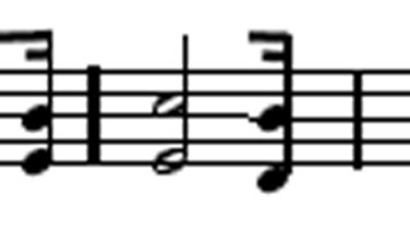
I have noticed the way Adobe Reader renders lines, etc., somewhat variably, but I've always assumed it was Reader, not LilyPond. I've attached an example from a screenshot of 2 different lines of score, magnified in PhotoShop. See the way the bar lines are different thicknesses, cross the staves differently, and even the stave spacing varies?
Doesn't concern me at all, but it does happen.

--
Phil Holmes
![]() PDFImage.jpg
PDFImage.jpg
Description: JPEG image
| [Prev in Thread] | Current Thread | [Next in Thread] |